Friday 13 May 2011

Evaluation - 7. Looking back at your preliminary task, what do you feel you have learnt in the progression from it to the full product?

Looking back at my preliminary tasks and the final outcome of that task I feel the final product of my task now are of a much higher standard. I feel that, by learning how to use Adobe Photoshop to a higher standard this has increased my work standard. On my preliminary task struggled to use Adobe Photoshop which left 2 of my covers without any editing at all. I feel the standard of the photos were poor and that the fonts I used for my cover lines made it look very unprofessional and tacky.
My music magazine cover, contents and double page spread is of a higher standard because I learnt how to use Photoshop better, and also because I feel I now fully understand the conventions of music magazines and how to make them look good and appeal to an audience. By evaluating many covers, double page spreads and contents pages I was able to see how real magazine companies layout their magazines and was able to reproduce this in my way.
The cover lines look quite tacky on my preliminary task so I tried to improve my standard on my music magazine. The seal of approval looks less professional and the image is unedited.
Overall, the longer the task went on the more skills I gained in different areas making it easier for me to produce a good quality music magazine front cover, contents page and double page spread.


Evaluation - 6. What have you learnt about technologies from the process of constructing this product?

Whilst constructing my cover, contents page and double page spread I have learnt how to use many aspects of Adobe Photoshop that I didn’t know how to use before.
I chose to use Photoshop because it was the best programme to use that would enable me to use the fonts I want and how to get the layout correctly, as well as allowing me to edit my pictures.
On the cover of the magazine I cut the figure from the background using the magnetic lasso tool. This then allowed me to create the fading red and white background with the gradient tool. I then used the smudge tool to make the outline of the figure less obvious so it looks more professional. For the cover lines I chose the font I wanted from 'dafont.com' and pasted them onto my cover. I had to use the magic wand tool to delete the background so they didn’t have a white box around them. I used the fill tool to change the colours. I used the shape tool to create the seal of approval and added a shadow to make it look raised.
I desaturated the image of the figure to make him black and grey. Finally, I added a glow to the title of my magazine ‘Sound’ to make it stand out and look different from the cover lines, and used the burn tool to darken some areas.
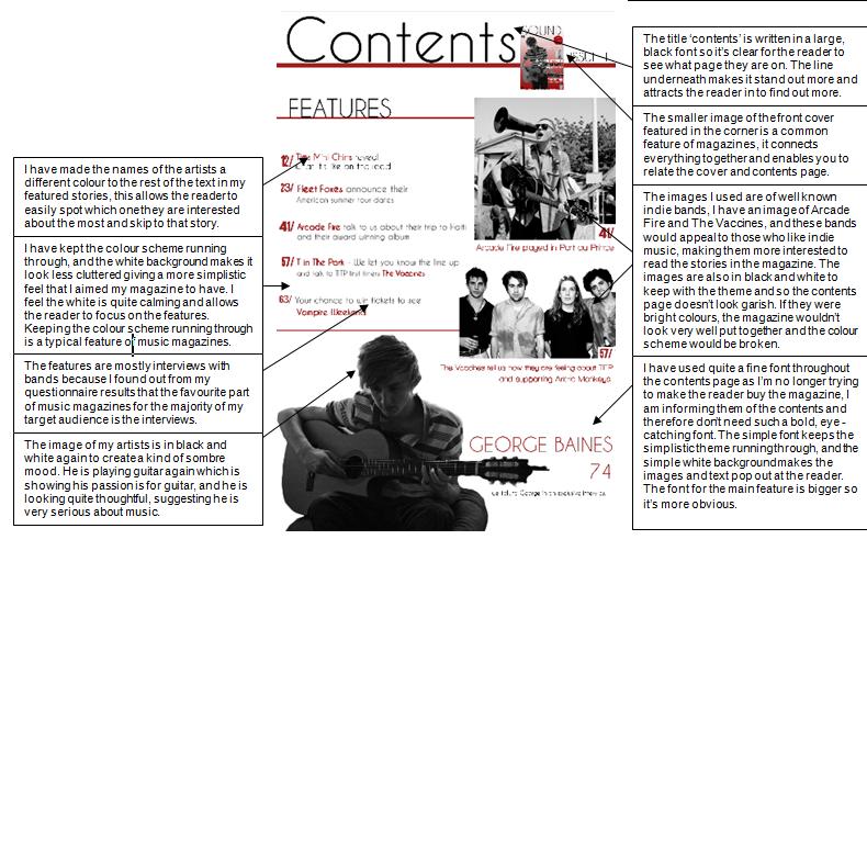
On my contents page I used the magnetic lasso tool again to cut out the figure. I again desaturated the image to keep the running theme of black and white images; I also desaturated the images I got off the Internet. I again used the smudge tool to make the outline less visible, and used the magic wand tool to delete the background of the writing and the fill to change the colour of the font. To make the lines I used the shape tool and selected the line, then I chose what size I wanted them and altered the colours using the fill tool.
On the double page spread I didn’t delete the background of the image; I kept it as I liked the greyness. Instead I used the eyedropper tool which allows you to select any colour from an image; I selected the grey of the background and applied to the background behind the image as the image didn’t reach the edges. I again had to use the magic wand tool to delete the background of the font and fill to change the colour. The actual text I used for the interview was already on Photoshop so I just used the text box tool to write that, I then highlighted the quotes and changed the font and colour using the tools at the top of the page.
Before my task, I wasn’t completely comfortable using Adobe Photoshop and didn’t understand some of the tools, however, this task has allowed me to heighten my Photoshop skills and will be useful in the future.


Evaluation - 5. How did you attract/address your audience? How did audience feedback help you to make important decision?

I attracted my audience on the cover, contents page and double page spread.

Evaluation - 4. Who would be the audience for your media product?

My target audience is teenagers aged 15 – 20, mostly males. The reason I have targeted males slightly more is because they are stereotypically more likely to buy indie music magazines which is proven by IPC Media having the music magazine 'NME' in the male orientated division. Despite this, my questionnaire results suggest it is likely that both genders will be interested in my magazine as I asked an equal number of males and females when I gave out my questionnaire and applied the results to my product. My target audience are interested in indie music and music festivals and would spend time on social networking sites such as Facebook where I plan to advertise my magazine.
From my questionnaire results I found that very few of my target audience currently bought music magazines, and the main reason for this was because they ‘weren’t interested’ which suggested that I needed to incorporate the things they wanted into my music magazine to make it successful and appealing.
I chose to do an indie magazine because that was my target audience’s most popular answer when I asked their favourite music genre, so by choosing indie I am appealing to the majority of my target audience. I also incorporated some of their favourite artists such as Biffy Clyro and I mentioned Jack Johnson in my interview with my indie artist.
50% of my target audience said their favourite part of music magazines are the interviews so the majority of my features were interviews of indie bands. Every person I asked said they would like upcoming gigs and tours to be advertised in my magazine, so bearing that in mind I had a feature about T in The Park, a well known music festival and I included a chance to win tickets to see Vampire Weekend, which would also act as an incentive to buy the magazine so they would be more interested. I also made my magazine a weekly magazine as the majority voted for this.
I also found that the majority of my target audience download music rather than purchasing it on CD’s which means I could offer ITunes vouchers and other downloadable related prizes in future issues.
The fact that I’ve taken into account all of this makes my magazine appeal to my target audience.

Evaluation - 3. What kind of media institution might distribute your media product and why?

Two media institutions that might distribute my music magazine would be Bauer Media and IPC Media. Bauer Media is a division of the Bauer Media Group. It is largest privately owned publishing group and offers 300 magazines in 15 different countries as well as online, TV and radio stations although it’s two main areas are magazine and radio. Because Bauer Media is a UK based institution, it would relate well to my target audience as my questionnaire results all came from people in the UK, and because Bauer Media distributes to 15 countries, my magazine could become well known and even more successful. The fact that it is focused mainly on magazines means that it is experienced in distributing to the right areas, and with magazines such as 'Kerrang' and 'Q' to their name they are an already well established brands that could boost my magazine to its full potential. Bauer Media Is also experienced in radio (Kiss FM), TV (The Box music channel) and the Internet, so my magazine could be advertised in these three areas. Being advertised on the Internet would greatly appeal to my target audience of teenagers aged 15 – 20, mostly males, and we could perhaps advertise on social networking sites such as Facebook and Twitter. Distribution could take place over the Internet as well making my magazine more widely available to my audience and those out of my main target audience. From my questionnaire results we can see that most people purchase music from download (i.e. ITunes, Napster), distributing and advertising over the Internet would allow my target audience to buy the music magazine and music at the same time, and I could advertise on these download websites.
Another suitable publisher would be IPC Media. IPC Media produces over 60 iconic media brands whose websites collectively reach over 20 million of their users each month. IPC Media has 3 divisions, IPC Inspire which focuses on appealing to men, IPC Connect which focuses on middle class women and IPC Southbank which is for more upmarket women. This means that overall IPC Media focuses mainly on women’s’ media products, the majority of their magazines relate to women, and none of the magazines for women are music based. This suggest they might be slightly less experienced than Bauer at reaching my target audience of teenagers aged 15 – 20, mostly males, as they are more focused on appealing to an older, more upmarket audience. IPC Inspire does produce the well known music magazine 'NME' which proves they are experienced in relating to a similar target audience as me, but this is the only music magazine the whole of IPC Media produces.

Overall I think Bauer is a much more suitable media institution to distribute my music magazine in the best and most efficient way.

Evaluation - 2. How does your media product represent particular social groups?

On many indie and alternative music magazines, the social group represented is slightly older than mine, around the mid 20’s. The band and artists featured on magazines such as Q are often shown in quite a rough way; they aren’t made to look pretty unlike artists on magazines such as Rolling Stone where the artists are usually made to look better by airbrushing. This could be because they want their magazine to be more about the music and be independent, that’s what indie is all about, and to appeal to the audience they need the artists to represent this indie image. Many of the current indie magazines represent males, there are more male artists featured in magazines like 'Q' and 'NME' than there are females, but females are still in represented in the magazines. This could be because stereotypically, males are more likely to buy indie magazines than females because that rough, ‘don’t really care about their appearance’ attitude is related more to males. Females are stereotypically thought to be interested in looking good, makeup and clothes.
My magazine represents a particular social group of young teenage males and females. On my cover the main image is of a male indie artist. The image is made to look quite grainy which gives it a more indie look, the figures hair is swept to one side and is quite messy and his clothes are casual, all of this represents young teenage males as they are known to be quite laid back and messy. He is slightly younger than the artists represented on real music magazines, but as my magazine is aimed at 15 – 20 year old, mostly males, it makes it easier for the audience to relate to the artist. George is holding an acoustic, not many of the indie music magazines I looked at had their artists playing an instrument in the image on the cover, for instance Q magazine has a cover where the artist Dave Grohl is blowing fire out of his mouth.
I have also used an image of a female artist on my front cover which is why my magazine represents both genders. She too looks quite ‘rough around the edges’ with baggy clothes and messy hair, which represents her as indie artist rather than the stereotypical female artists that are made to look pretty, especially female pop artists such as Katy Perry. She looks quite awkward in the way she stands which is a look often used in indie magazines to make the artist appear different than average.
The images I have used on the contents page are of stereotypically indie bands. The image of the vaccines makes them look dirty, with something spilled down some of their shirts. They are all looking at the camera and they all have different expressions on their faces, one of the artists looks miserable, and another is grabbing his band members head. Their hair is messy and clothes are dirty and wet, giving the image that quirky look that relates to indie bands.
The image of George on the contents page also has him playing acoustic guitar, his clothes and hair are the same, and he is sat on a beanbag. This gives the image quite a laid back, casual look, and in magazines such as NME the contents pages tend to be full of text and images, and the images are usually of the band standing or performing on stage which is a more hectic look than my contents page.
On my double page spread I used an image of George looking directly in the camera with a slightly puzzled look on his face which is quite a conventional look for indie artists. He is wearing a hooded fleece pulled halfway over his head and a plain grey shirt which continues the simplistic style of my magazine. His hair is slightly messy and he looks quite awkward, which many indie artists look like to make their image quirky and memorable.


Evaluation - 1. In what ways does your media product use, develop or challenge forms and conventions of real media products?

My music magazine has used, developed, and challenged existing conventions of music magazines.

 How did it use conventions of real media products?
-
On my front cover I used a variety of different fonts for the different cover lines to fit with the conventions of a music magazine front cover, I used 5 different fonts altogether.
- My cover has several cover lines and one main cover line that relates to the main image which is a common feature of magazines. The main cover line was written in a bigger, bolder font which is the way a main cover line is usually displayed.
- I have also used a pull quote from the interview on the cover underneath the main cover line which relates to the main image, this is a typical feature of music magazines and magazines in general.
- My front cover has a main image which ties in with the main cover line and is quite central to the page. I have also used a smaller image which relates to another cover line and is less obvious than the main image, as many music magazines around include more than one image on their covers.
- I used the word ‘exclusive’ on the front cover and double page spread which is quite a conventional word used on cover lines as it makes reader more interested as they think they won’t find the information anywhere else.
- At the bottom of my front cover I wrote a list of bands featured, which is very common, especially in indie and alternative magazines.
- On my contents page I featured a small picture of the front cover in the corner, this is a convention of music magazines and I have seen it in magazines I have researched such as ‘Q magazine’.
- On my contents page I have used the title ‘contents’ to make it clear what is displayed on the page, which many magazines do. Some choose to write something different, for instance, from my research I found 'NME' magazine often writes ‘NME this week’, however I chose ‘contents’ because my magazine is new and I thought it would be more appropriate.
- I have put the stories or features to the left of my contents page which is a commonly used layout for music magazine contents pages, and I have made the names of the artists a different colour so they stand out and the reader can easily see who is featured.
- My contents page has more than just one main image; it has other smaller images relating to the other features.
- In my double page spread I have used just one large image of the artist which takes up the whole of the right page. I have seen this convention used in a few magazines and I think it give the magazine a more professional look, an example would be the double page spread I analysed from Classic Rock magazine, where the image of the band Mötley Crüe take up one page.

How did it develop the conventions of real media products?
-
I have included a seal of approval on my magazine front cover that offers reader a chance to win tickets to see the band Vampire Weekend. Many magazines use seal of approvals, but some like 'NME' simply put another cover line in them, whereas I have offered my readers a chance to win something which will entice them in to buy my magazine.
- In my double page spread I have not only changed the colour of the key quotes, but I have also increased the size of the font to make them even more eye-catching. Both of these conventions are used in magazines; however they aren’t usually used together at the same time.

How it challenged the conventions of real media products?
-
On my front cover all of my cover lines are on the right side of the page. Usually the cover lines are either distributed on either side of the main image or on the left, I chose to put my cover lines on the right as this way they would cover up less of the main image and keep the focus on the artist on the cover.
- My contents page is quite minimal, and I have used fewer images than many of the contents pages I looked at. Q magazine tends to have quite a full contents page with a huge amount of text, and the background is almost completely covered by images and boxes of text. My contents page is quite minimalist and there is quite a lot of blank space because I wanted to steer clear of clutter and keep the minimal theme running through.
- On my front cover, the main image of an indie artist doesn’t use a direct mode of address. The image I chose shows the figure looking down as if he is playing guitar, whereas usually the main image on the cover has a direct mode of address to interact with the reader. I chose to use this image as I think the figure clearly represents and indie artist and this shows the reader what genre of music my magazine focuses on clearly.

Thursday 21 April 2011

Plan of photoshoot

Plan of photo shoot
Costume: The costume needs to represent the genre of the magazine, so I put my artist in casual jeans and a striped polo shirt to represent my indie magazine. I want him to look like he doesn’t really care about his clothes that much and is wearing something that he would wear everyday. It needs to look like those are his clothes that he likes because indie music is about being independent.
Props: George will be stood with a guitar in his hands for the image on the front cover, I will take other pictures with him sitting and playing the drums so that I have a variety to choose from and various images to put in the double page spread and contents page. The use of the musical instruments makes it clear that the magazine is a music magazine.
Setting: The setting was in George’s music room where he keeps his instruments, however I will edit the background to fade from red to white to keep with the colour scheme and make the figure stand out so there is no clutter in the background ensuring the is the first thing you look at, and so that my magazine fits with the conventions of other music magazines.
Facial expression, pose, body language: George will be standing so that we can clearly see him holding the guitar as if he was playing it, so he will be looking down at the guitar. In many indie magazines the figure is not always using a direct mode of address or smiling, they often look away. George will have a neutral pose that makes him look like he’s concentrating on the music he’s playing rather than posing for a magazine cover.
Hair and make - up: His hair will be messy and styled too look like it didn’t take long, he will look casual, this is quite a common look for indie artists.
Shot types: A medium shot has been used to allow most of his body to be visible so we can see how he is standing and the clothes he is wearing.
Lighting: The lighting won’t be very dramatic on the figure; the bright background will make the figure appear darker and the light will have come from behind the figure so he’s fairly dark, making him the main focus on the cover.

Thursday 14 April 2011

Wednesday 13 April 2011

Tuesday 22 March 2011

Names and fonts


To determine what fonts i should use on my magazine cover, I showed my target audience a range of names and fonts and asked them choose 1 name and 1 font that was their favourite and that they think would be most suitable for an indie magazine. When asked to choose their favourite font, there was a tie between 2 of them, so i chose which font i thought would be most suitable.

Questionnaire results analysis


Here i analysed the results of the 20 questionnaires i handed out. The information i received has helped me to plan out the different areas of my magazine such as genre, what will be included in the cover lines and what competitions and offers i can include.

Sunday 13 March 2011

Analysis of magazine front cover

Here i analysed the branding, representation of the artist, structure, language feautures, presentational devices, target audience and how the magazine achieves it's purpose for 'Q' magazine.

Friday 18 February 2011

Mock - up of existing magazine front cover


Here is my mock up of the Rolling Stone magazine of Prince.
I chose to do a magazine cover with Prince on the cover because i have a friend that looks a bit like him. I stood them against a white board, i would of used a white screen but in the original image the background is slightly discoloured so the whiteboard seemed best. I put mascara on his face to look like facial hair and a mole. The lighting was coming from above in the original magazine cover, so i did ther same in my mock up, plus darkening the underneath of the eyes to enhance this.
I used Photoshop to edit my image, i started off by changing the colour of his eyes, Joels eyes are actually green, but Prince's are brown so i used the burn tool on Photoshop to darken them.  I then used the burn tool again to darken the moustache and beard and his eyebrows. I then slightly darkened around his eyes and cheek bones to make his face more defined. Next i took the hair from the original image and pasted it in, and i did the same with the collar. I used the text tool and found the most suitable font that looked most like the original. I found a barcode on the internet and pasted onto my image. The title 'Rolling Stone' was difficult to replicate using the normal fonts so i got one of the titles off the internet and changed the size and colour.
I would say that the font i used was as close to the orginal as possible, and i am happy with this area of the cover. I think i made the face as similar as possible and this was another successful part, i think the lighting i used worked well, it's not too ehnanced.
The facial hair doesn't look very realistic, perhaps if i had used fake facial hair rather than mascara this would have turned out better. I think the hair and collar that have been pasted in don't look very realistic because they have become slightly pixelated, and this would be something i'd like to improve on. I think the barcode i used is slightly too bright, the magazine cover i was replicating was done in 1990 and the barcode and background were quite discoloured, i should have found a slightly more yellow barcode to enhance this.

Monday 7 February 2011

Questionnaire

Questionnaire
Hello, my name is Samantha Hulmes and I am a student at Sponne School sixth form. I have devised this questionnaire to find out what sixth form students would like in a music magazine, and I would appreciate it greatly if you could take time to fill out this questionnaire. Please circle the appropriate answers, and if for any reason you feel uncomfortable answering a question, feel free to leave it blank.
Many thanks
Samantha Hulmes

What gender are you?
Male         
Female

How old are you?
7-10
11-14
15-18
19-22
23+

What is your favourite music genre? (Please tick one)
Pop
Rock
Indie
Drum and Bass
Other
…………………………………………………………………………………............

Do you buy music magazines?
Yes
No

If so, what music magazines do you buy?
…………………………………………………………………………………………..

If not, why?
…………………………………………………………………………………………..

How often do you buy music magazines? …………………………………………………………………………………………..

How much disposable income do you have per week?
£0 - £10
£11 - £20
£21 - £30
£31+

How much are you prepared to spend on a music magazine?
0 – 50p
51p - £1
£1.1 - £2
£2.1 - £3
£3.1 - £4
£4.1 +

What is your favourite part of a music magazine?
Interviews
Stories
Quizzes
Free offers
Other
…………………………………………………………………………………………..

Should the language used in the magazine be formal or informal?
Informal
Formal
Both

Does the main image attract you to the magazine?
Yes
No
Sometimes

Where do you usually buy your magazines from?
…………………………………………………………………………………………..

Who is/are your favourite music artist(s)?
………………………………………………………………………………………….

Do you go to music festivals and concerts?
Yes
No

Would you like upcoming gigs and tours to be advertised in the music magazine?
Yes
No

How often do you think a music magazine should be published?
Daily
Weekly
Monthly

How do you purchase your music?
CD
Download
Other
…………………………………………………………………………………………..

Thank you

Sunday 30 January 2011

Target Audience


Here i have analysed the music magazines 'Q' and 'Top of the Pops' and wrote the target audience for each magazine, based on the price, colours, coverlines, main image, special offers and other musicians mentioned on the covers.

Saturday 22 January 2011

Representation of Artists in Music Magazines

Here i talked about the representation of each of the artists on the covers of the magazines in terms of costume, facial expression, pose, hair and make up and framing.

Music Magazine Analysis

Here i analysed the layout, presentational devices, language and content of the music magazine KERRANG!

College Magazine Front Covers

This is the magazine cover that i feel is the least successful. The set up is similar to my most successful cover, with the props and the background the same. On this cover, i think having the cover lines spread over both sides works quite well, and the headline stands out to the reader. I also feel that the seal of approval appeals well to my target audience as many college students are interested in music. 
However, i feel that the quality of the image is poor, and the face seems quite blurred. I also feel that the figure looks quite uneasy, and the props are in the way of her body. Also, unlike my most successful cover, the seal of approval is covering the paint pots in the background, which i think makes the magazine less colourful. Also, the background looks quite busy, more so than my most successful cover, because of the cover up of the paint pots. In this cover i only included 3 cover lines unlike my previous magazine covers which both had 4, and this means there is less for the reader to look at. Also, none of the cover lines relate to the main image.

College Magazine Front Covers

This is the magazine i feel is my second most successful. I think the colour scheme works well, the blue on the wall and the bits of blue on the figures shirt works well, and the wall being all one colour allows for the headline to stand out. I feel that the cover lines also stand out, and you can see that i went for the simple black and white look which i think helped this. I feel that the seal of approval also works well, and the word 'WIN!' attracts the reader. I also feel that the image is of a good quality and looks good enough to be on the cover of a magazine; it's believable. The cover lines would appeal to college students, and the 'WIN! £100 worth of Topshop vouchers' would appeal to males and females, as the figure in the image is wearing clothing from that actual shop.
I think the cover is missing a few things, for instance, the figure is not engaging the reader by using direct mode of address. Some of the cover lines relate to the main image, however their isn't a clear main cover line linking the image to the stories. I also feel that the cover is maybe a bit too simple, i didn't use any props and could have done with adding more colour into the cover lines. I also feel that a completely blank wall would have been better to use rather than the wall having photos on it, because this take away from the main image and the cover lines and may lead the reader to think the magazine could have something to do with photography, which it doesn't.

College Magazine Front Covers

This was the magazine front cover that i chose as my most successful. I wanted the cover to look like it was set in a school, and the image needed to represent school life so it was obvious that my magazine was a college magazine. I chose to take my image in the art room because there were props that could be used to make my cover look like the genre of magazine it is. I tried to make my cover look quite simple but effective, for my cover lines i used a simple black and white colour scheme, i thought this was appropriate as white connotes simplicity and black connotes sophistication. Other colour was provided by the paint pots in the background to make it less boring. I chose to relate my main cover line to art and to the person i used on the front of the magazine so that it all tied together. I chose to write the name of my magazine underneath the initials, because 'HSF' was easier to place correctly on the cover than 'Hello! Sixth Form' as the title was too long for me to write it big enough to stand out. In the seal of approval i used a buzz word to grab the readers attention, i wrote 'FREE!' in capital letter and used an exclamation mark to make sure it was hard to miss, and offered a free Christmas CD to relate to the season the magazine cover was created in. I chose cover lines that would appeal to my target audience of college students. I used a direct mode of address so that my audience would be enticed in and want to purchase my magazine.
I feel that some improvements could be made to my cover. For instance, the paint pots i used could be moved slightly left so that they don't get in the way of the figure, we cannot see her body. Also, i think the quality of the image could have been improved and the background could have been better, i think if i would have taken the image with a wall in the background rather than a window and a sink the cover would have been much more effective, and the cover lines could have been a lot more eye catching. 
However, overall i am happy with the outcome and think that the magazine as a whole works well and fulfills its purpose. 

Friday 7 January 2011

Introduction

Hi, im Samantha and i'm studying AS media at sponne school sixth form. For our coursework we will produce a front cover, contents page and double page spread for a new music magazine.