My music magazine has used, developed, and challenged existing conventions of music magazines.
How did it use conventions of real media products?
- On my front cover I used a variety of different fonts for the different cover lines to fit with the conventions of a music magazine front cover, I used 5 different fonts altogether.
- My cover has several cover lines and one main cover line that relates to the main image which is a common feature of magazines. The main cover line was written in a bigger, bolder font which is the way a main cover line is usually displayed.
- I have also used a pull quote from the interview on the cover underneath the main cover line which relates to the main image, this is a typical feature of music magazines and magazines in general.
- My front cover has a main image which ties in with the main cover line and is quite central to the page. I have also used a smaller image which relates to another cover line and is less obvious than the main image, as many music magazines around include more than one image on their covers.
- I used the word ‘exclusive’ on the front cover and double page spread which is quite a conventional word used on cover lines as it makes reader more interested as they think they won’t find the information anywhere else.
- At the bottom of my front cover I wrote a list of bands featured, which is very common, especially in indie and alternative magazines.
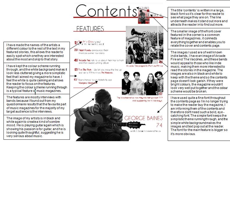
- On my contents page I featured a small picture of the front cover in the corner, this is a convention of music magazines and I have seen it in magazines I have researched such as ‘Q magazine’.
- On my contents page I have used the title ‘contents’ to make it clear what is displayed on the page, which many magazines do. Some choose to write something different, for instance, from my research I found 'NME' magazine often writes ‘NME this week’, however I chose ‘contents’ because my magazine is new and I thought it would be more appropriate.
- I have put the stories or features to the left of my contents page which is a commonly used layout for music magazine contents pages, and I have made the names of the artists a different colour so they stand out and the reader can easily see who is featured.
- My contents page has more than just one main image; it has other smaller images relating to the other features.
- In my double page spread I have used just one large image of the artist which takes up the whole of the right page. I have seen this convention used in a few magazines and I think it give the magazine a more professional look, an example would be the double page spread I analysed from Classic Rock magazine, where the image of the band Mötley Crüe take up one page.
How did it develop the conventions of real media products?
- I have included a seal of approval on my magazine front cover that offers reader a chance to win tickets to see the band Vampire Weekend. Many magazines use seal of approvals, but some like 'NME' simply put another cover line in them, whereas I have offered my readers a chance to win something which will entice them in to buy my magazine.
- In my double page spread I have not only changed the colour of the key quotes, but I have also increased the size of the font to make them even more eye-catching. Both of these conventions are used in magazines; however they aren’t usually used together at the same time.
How it challenged the conventions of real media products?
- On my front cover all of my cover lines are on the right side of the page. Usually the cover lines are either distributed on either side of the main image or on the left, I chose to put my cover lines on the right as this way they would cover up less of the main image and keep the focus on the artist on the cover.
- My contents page is quite minimal, and I have used fewer images than many of the contents pages I looked at. Q magazine tends to have quite a full contents page with a huge amount of text, and the background is almost completely covered by images and boxes of text. My contents page is quite minimalist and there is quite a lot of blank space because I wanted to steer clear of clutter and keep the minimal theme running through.
- On my front cover, the main image of an indie artist doesn’t use a direct mode of address. The image I chose shows the figure looking down as if he is playing guitar, whereas usually the main image on the cover has a direct mode of address to interact with the reader. I chose to use this image as I think the figure clearly represents and indie artist and this shows the reader what genre of music my magazine focuses on clearly.


